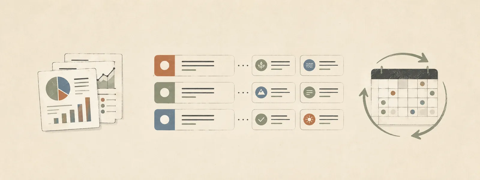
Two earlier posts here cover getting health data collected (synced automatically from a phone into a structured file) and getting it organized (filed into a clean, current-state layer on top of a personal archive). Neither one, on its own, changes what you do at a doctor’s visit. A well-organized chart is still a chart. This post is about turning it into a plan, and keeping that plan from going stale the way health resolutions usually do.
- What this actually is (and isn’t)
- The rule that makes it useful: strictly additive
- Structure: reasoning attached to every line, not just a task list
- The monthly review loop
- A silent plan is a stale plan
- End state
0. What this actually is (and isn’t)
Call it a longevity plan or a healthspan plan, whatever you like. The content is a short, chart-derived list of labs, imaging, functional tests, and behavior changes worth raising at a doctor’s visit, each one tied to a specific reason from the chart rather than a generic “things people over 50 should think about” list.
Two framing choices matter more than anything in the content:
It’s not a diagnosis or a treatment plan. It’s preparation material. The goal is a better-informed conversation at an appointment, not a replacement for one. That distinction has to survive being written down, or the document turns into something it shouldn’t be.
It exists to coordinate across specialists who don’t see each other’s records. A cardiologist, an endocrinologist, and a sleep clinic each get a narrow slice of the picture. Nobody except the person living in that body — and now this document — sees all three slices at once. That’s the gap it fills.
1. The rule that makes it useful: strictly additive
The most important constraint on this document: it never duplicates what a standard checkup already covers. If a lab is already on the checklist for an upcoming visit, it doesn’t also appear here. It stays where it already lives, once.
This matters because the common failure mode is a “personalized” health document that’s mostly generic filler — “eat more vegetables,” “get enough sleep” — with a name at the top. That kind of document loses your trust by the second read, because none of it needed to know anything about you. Here it’s the opposite: every line exists because of something specific in the chart, and a section at the bottom lists what the standard checklist already handles well, so nothing gets duplicated by accident later.
The list stays narrow and evidence-weighted rather than aspirational. Longevity medicine covers a wide range of tests and interventions with very different evidence behind them; this document sticks to the well-established, low-downside end and skips the speculative end.
2. Structure: reasoning attached to every line, not just a task list
The plan has three categories — additive labs, imaging and functional tests, behavioral priorities — and every item carries its reasoning inline, not just a name. Not “ApoB” but why ApoB, given what the last lipid panel showed and what ApoB catches that a standard panel doesn’t. Not “resistance training” but which gap in an otherwise-strong fitness picture it addresses.
That’s the point. A bare list of test names is something you could get from a search engine. A list where every item explains why it matters for this chart only exists because someone read the chart.
The tracking half is a checklist: checkbox, status, and once something is done at a visit it moves to a completed line with a date and a pointer to where the result landed. The plan should show progress over time, not sit as a wish list that gets ignored or forgotten.
3. The monthly review loop
This is a separate, recurring task from the one that built the plan in the first place — a scheduled monthly pass, per person, that:
- Reads the plan’s current checklist.
- Reads the chart notes the plan is derived from (the running summary, the lab-trend table, the wearable-trend table).
- Checks whether anything on the checklist has since been actioned, and whether any new finding changes what should be prioritized.
- Updates the plan in place — never a rewrite from scratch, just edits to what changed.
- Logs a dated entry describing exactly what changed this pass.
The cost discipline is the part worth calling out. A monthly review that re-extracts everything from source documents each time would be expensive, and it would duplicate work two other parts of this system already do: filing new documents, and a weekly audit that catches anything not yet summarized. So this review only reads the already-processed notes. If it spots a source document newer than the plan’s last update that hasn’t been folded into those notes yet, it flags that gap for the other layer rather than doing the extraction itself. It stays cheap by staying narrow about whose job is whose.
4. A silent plan is a stale plan
Even a review that finds nothing to change still writes a log entry: “reviewed, no changes, N items still open, nothing new shifts priorities.” That’s not busywork. A plan with no review history looks the same as a plan nobody checks anymore, so a monthly cadence only means something if “no news” and “no one looked” stay distinguishable on the page.
This is the same instinct as a rule from the archive-reorg post: a stale note is worse than no note, because it looks authoritative right up until it’s wrong. Here it’s a habit rather than a check — silence gets logged on purpose, so it reads as “confirmed current” instead of “abandoned.”
End state
- A short, chart-derived plan per person — labs, imaging, functional tests, behavior changes — every item carrying its own reasoning, not a generic checklist with a name on it.
- Strictly additive to standard care, with a record of what’s already covered elsewhere, so scope can’t creep.
- A visible progress tracker: checkboxes move to dated, linked completions instead of sitting untouched.
- A monthly review that stays cheap by only reading already-processed notes, handing off anything that needs real extraction to the layer built for it.
- A logged entry on every review, changes or not — the plan’s own proof that someone is still watching it.
The series so far is one idea at three levels: collect the data, organize the data, then use it for something, and don’t let any of the three quietly stop. This is the “use it” layer, and the monthly loop is what keeps it from becoming one more good intention that fades by March.